
The project
Visual theme creation for shadcn-vue
shadcn-vue Theme Generator is a workspace for creating CSS themes without editing every variable by hand. The editor brings semantic tokens together, shows their effect on components and screens, and lets you copy the final CSS into another project.
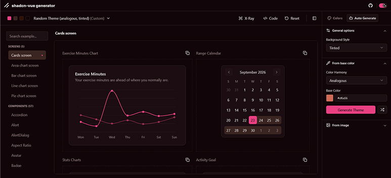
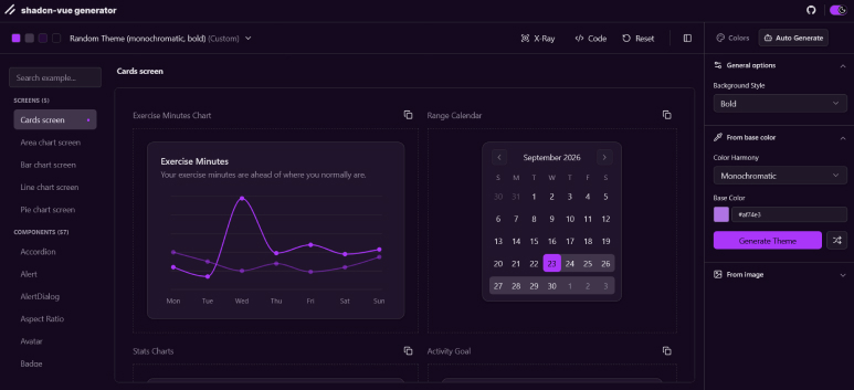
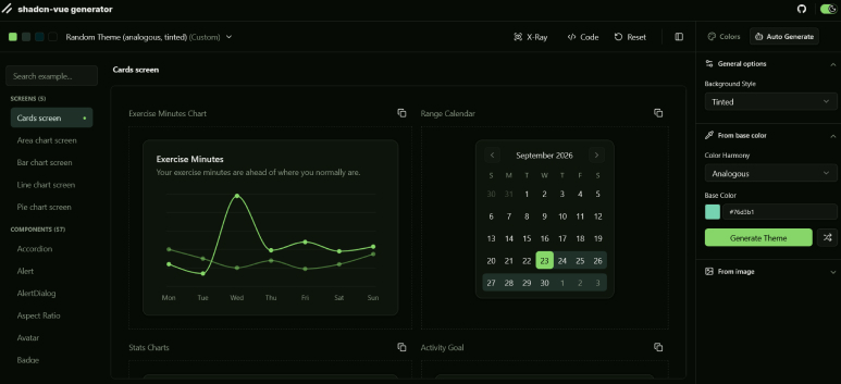
Alongside direct editing, it offers two starting points: generating a theme from a color or extracting a palette from an image.
Starting point
Problem
A shadcn-vue theme involves much more than a primary color. Backgrounds, text, surfaces, borders, states, charts, and sidebar colors need to work together in both light and dark modes. Editing those variables one by one in CSS makes it difficult to see how each decision affects the full interface.
When I created this project, I could not find a relevant theme editor focused on shadcn-vue. Editors built for shadcn/ui were useful references, but subtle implementation differences meant their results did not always transfer directly. That motivated me to explore a tool designed specifically for the Vue ecosystem.
This project explores a more visual and direct way to create, test, and export that color system. Its preview makes it possible to judge the result on actual components instead of relying only on palette swatches.
Use cases
Who it is for
The tool is intended for people building interfaces with Vue and shadcn-vue who want to explore a visual direction before bringing it into their code. It also lets designers see how a palette behaves across forms, tables, charts, and complete screens.
These are potential uses of the tool. The project does not have user research or adoption metrics that would establish them as validated needs.
Core decision
Solution
I organized the editor around tokens with defined roles: primary, background, card, border, destructive, and the rest of the system. Each field combines a color swatch with an editable value. Changing it updates the preview and shows its effect on the interface.
Tokens are grouped so the panel remains easy to navigate. Preset themes provide a starting point, while light and dark mode switching, contrast checks, and CSS export support the process through to use outside the editor.
Workflow
How a theme takes shape
- 01
Choose a starting point
Begin with a preset theme, a base color, or an image loaded in the browser.
- 02
Adjust semantic roles
Edit colors directly and check their effect on example components and screens.
- 03
Check legibility
Compare light and dark variants and review contrast checks for color pairs.
- 04
Export the result
Copy the theme's CSS variables into a project using shadcn-vue.
Features
Color editing and contrast

The panel groups semantic tokens while keeping example components in view. When a color is adjusted, the preview updates immediately, and the WCAG check indicates whether its pairing with text has sufficient contrast.
The catalog, search, and Component X-Ray help identify which variable controls each element. Changes are stored locally in the browser.
Features
Automatic generation
From a color

Choose a base color, a color harmony, and a background style. The generator works in OKLCH to build related colors and assign them to theme roles, including light and dark variants, chart colors, and sidebar colors. It also adjusts background and text combinations to support contrast.
From an image
The image is analyzed locally with Canvas. The process extracts colors from its pixels, removes candidates that are too similar, and selects colors for the main roles. Before generating the theme, you can choose a conservative or expressive interpretation of the palette.

Both results remain editable: generation proposes an initial system, and the panel lets you refine each token.
Features
Export

Once the theme has been adjusted, its CSS variables can be copied into a shadcn-vue project. The export preserves the tokens for both light and dark modes so the work can continue outside the editor.
Implementation
Architecture
The application uses Vue 3, TypeScript, Vite, Tailwind CSS 4, and shadcn-vue components built on Reka UI. Culori handles color conversions, and OKLCH provides the working color space for palette generation.
The editor and preview are separate Vite entries. The preview runs in an iframe, preventing the styles of test components from interfering with the editor controls. The two parts communicate through postMessage: the editor sends tokens and the preview applies them as CSS variables; preview interactions can also send information back to the editor.
Image color extraction and theme persistence happen in the browser without requiring an API for those tasks.
Final reflections
Learnings
This project helped me approach color as a set of roles and relationships rather than isolated values. Generating a complete theme meant considering how surfaces, text, states, and charts work together, not simply producing appealing colors individually.
It also reinforced the value of showing the effect of each decision. Direct editing, contrast checks, and previews on real components turn visual exploration into a process that can be evaluated before exporting the CSS.